Image Credit: Unsplash
Physical spaces and digital products solve many of the same problems. Both guide people toward a destination, signal available choices, and reduce confusion along the way. A well-designed building feels intuitive because entrances, pathways, and rooms support what visitors came to do. Good UX design creates a similar sense of direction on a screen. Looking at architectural principles can help designers organize information, remove obstacles, and create digital experiences that feel comfortable from the first interaction.
Mapping User Journeys Through Physical Space
Architects study how people enter a site, move between areas, and reach key destinations. UX teams can apply the same thinking to a website or app. The Nielsen Norman Group’s explanation of user journeys and flows shows how one model captures a person’s wider experience while the other documents specific interactions.
Start with the user’s purpose. Someone entering a library may want to return a book, find a quiet desk, or ask for help. Each goal needs a clear route. In an online store, comparable routes might lead to search, product details, or customer support. Map each route from entry to completion, then flag points where users must stop, backtrack, or guess.
The Role of Friction and Natural Flow
Physical design uses doors, steps, lighting, and path width to control movement. Some friction is useful, such as a gate that separates a private courtyard from a public area. Excess friction makes a space tiring or confusing. Digital interfaces follow the same principle. Account verification may protect sensitive information, while an unnecessary registration screen can cause visitors to leave.
Outdoor spaces offer especially useful lessons because their paths must account for changing views, practical access, and transitions between active and quiet areas. When a Sydney homeowner needs that kind of spatial planning, a landscape architect can connect circulation with planting, construction, and long-term garden care.
For digital products, review each action and ask what purpose it serves. Remove duplicate fields, explain unavoidable delays, and place the next step where users naturally expect to find it.
Translating Wireframes to Structural Blueprints
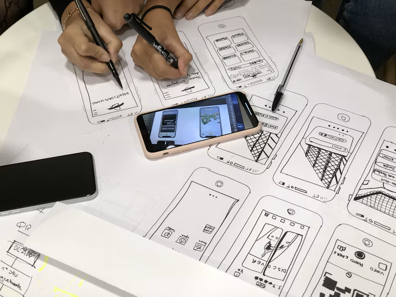
A blueprint establishes relationships before builders focus on finishes. Wireframes perform a similar job by defining page hierarchy, navigation, and content placement before colors or imagery command attention. They reveal structural weaknesses early, when changes remain relatively quick and inexpensive.
Treat every screen as a room with a clear function. A checkout page needs an obvious route forward, visible order details, and access to corrections. A dashboard should group related controls and keep frequently used information close at hand. This approach echoes the principles behind good business space design, where layout supports daily behavior and reinforces the purpose of the environment.
Test wireframes using realistic tasks. Ask someone to update an address or locate an invoice without hints. Hesitation often exposes a structural issue that polished visuals could conceal.
Sensory Balance Across Every Touchpoint
Architecture shapes experience through light, texture, sound, and scale. UX design works with its own sensory materials, including typography, color, animation, and feedback. Balance matters because too many signals compete for attention, while too few can leave users unsure that an action worked.
A practical app user flow should connect visual cues to each stage of a task. A button can change state after a tap, a short message can confirm a saved preference, and an error can appear beside the field that needs correction. Keep motion brief and purposeful. Maintain readable contrast and use consistent labels so people don’t have to relearn the interface from one screen to the next.
Review the experience across devices as well. A layout that feels spacious on a desktop may become crowded on a phone, just as a generous hallway can feel restrictive once furniture blocks the route.
The strongest digital experiences give people subtle guidance without demanding constant attention. When the structure is clear, each sign, transition, and control supports the next action. That’s the point where an interface begins to feel less like a collection of screens and more like a place designed around the people using it.