Image Credit: Unsplash
Minimalist kitchens feel calm because large areas read as single, uninterrupted shapes. When walls, counters and cabinets have fewer visible breaks, the eye can move through the room without stopping at every joint or change in material. This approach also helps practical features such as storage, lighting and work zones blend into the overall design.
Flat surfaces alone won’t create a successful minimalist kitchen, though. Proportion, material choice and carefully placed texture all affect how comfortable the finished room feels.
Visual Weight and Interior Balance
Every line in a kitchen adds visual weight. Cabinet gaps, shelf edges, appliance frames and wall joints can make a compact room appear busier than it is. A broad, unbroken wall surface gives the eye somewhere to rest and helps detailed elements, such as timber grain or stone veining, stand out.
Ideas behind cohesive kitchen design also apply to color placement. Repeating one pale tone across upper cabinets and the wall can make the ceiling feel higher, while a dark continuous backsplash creates a strong horizontal anchor. Before selecting finishes, view samples beside the cabinetry under daytime and evening light. Artificial lighting can change a cool gray into blue or make cream look yellow.
The Inconvenience of Grout Lines
Tile grout creates a grid that can compete with streamlined cabinetry. Even subtle joints become more noticeable behind a long counter, especially when the grout contrasts with the tile. Articles discussing grout-free kitchen walls often highlight the cleaner appearance of larger panels, but daily upkeep matters too.
Grout is porous unless properly sealed, so splashes near sinks and cooking areas may leave discoloration. Narrow joints also take longer to wipe because residue can settle below the tile face. Homeowners considering glass splashbacks can choose painted, printed or mirrored finishes for a broad surface with minimal joins. Measure around outlets, corners and cabinets carefully since accurate fabrication is central to a tidy result.
Modern Alternatives for Sleek Walls
Large-format porcelain, engineered stone, stainless steel and glass can all reduce the number of visible joints. Each material brings different practical qualities. Porcelain resists heat and scratches, while stainless steel suits a more industrial interior but readily shows fingerprints. Engineered stone can coordinate with a countertop, subject to the manufacturer’s guidance for vertical installation and heat exposure.
Consider how the wall will be cleaned before choosing a finish. Glossy surfaces reflect light and wipe down easily, though they can reveal streaks. Matte panels soften reflections but may hold oily marks depending on their texture. Ask for a full-size sample or view an installed panel instead of relying on a small swatch. A 4-inch sample rarely shows how reflections, patterns or color variation will look across an entire wall.
Balance Texture with Flat Surfaces
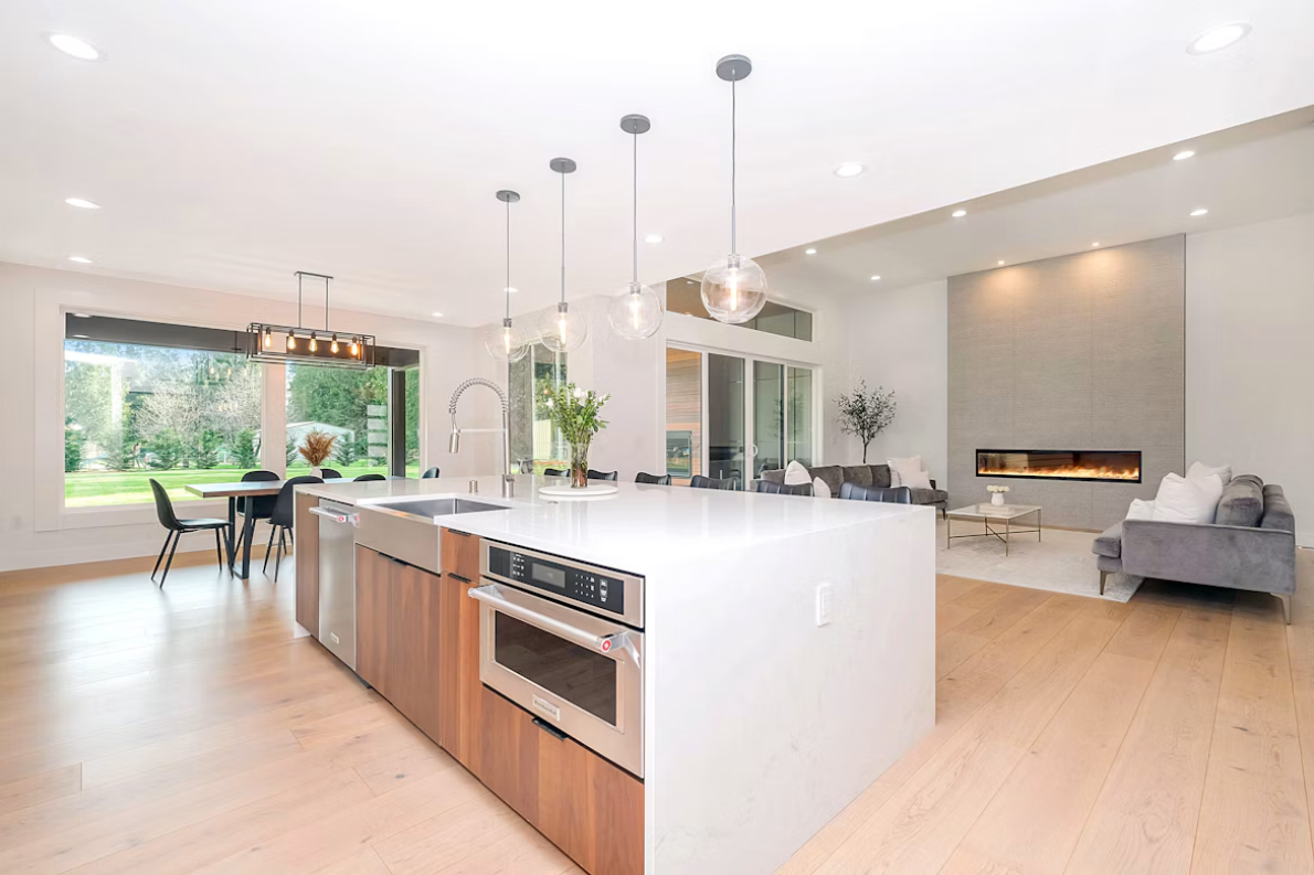
A kitchen made entirely from smooth white materials can feel stark, so add texture in controlled areas. Timber cabinet fronts, ribbed pendant lights or woven counter stools introduce warmth without filling the room with competing patterns. Keep the largest planes quiet, then let one or two tactile details provide character.
Texture also works well below eye level. A veined countertop or subtly grained island front adds interest while leaving the main wall visually calm. Open shelving needs more restraint because every object becomes part of the composition. Group everyday pieces by material or color and leave some space around them. If the backsplash has a printed pattern, use plain cabinet hardware and simple lighting so the wall remains the clear focal point.
Large wall panels make their strongest contribution when their edges align cleanly with cabinets, counters and architectural features. Before approving the final layout, mark proposed joints and panel boundaries on the wall with painter’s tape. Viewed from the doorway, those temporary lines quickly reveal if the design feels calm or unnecessarily divided.