Image Credit: Unsplash
A building shapes brand perception before a visitor speaks to an employee, reads a brochure or uses a service. Its entrance, materials, signage and interior layout all signal how the organization operates.
A polished digital identity can lose credibility when the physical setting feels neglected or disconnected. For customer-facing businesses, offices and community facilities, architecture offers a practical way to turn brand values into an experience people can see and remember.
The Tangible Impact of Visual Cohesion
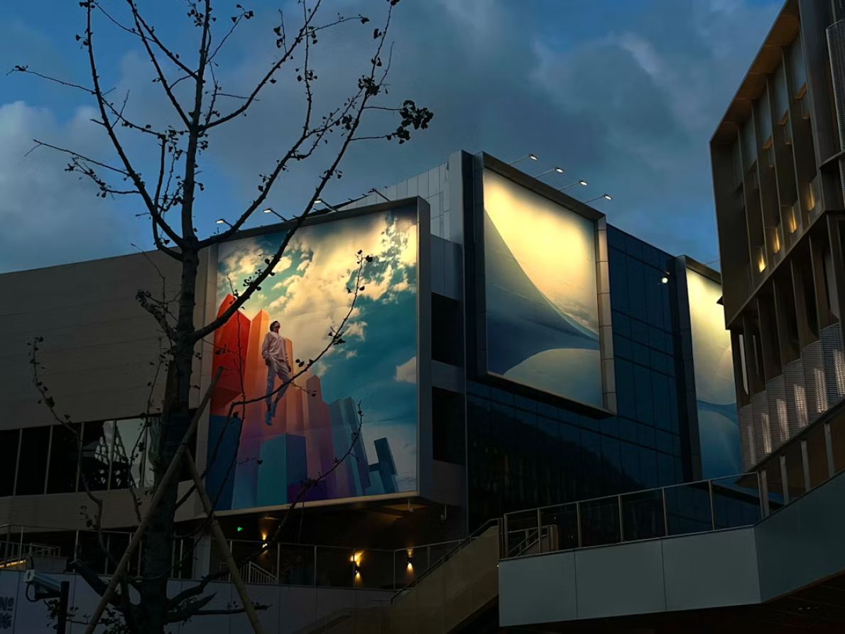
Visual cohesion helps visitors recognize the same organization across digital and physical settings. Consistent colors, typography, materials and signs create familiarity, while orderly pathways make the property feel considered. Research into branding in architecture examines how buildings communicate identity through both imagery and spatial design.
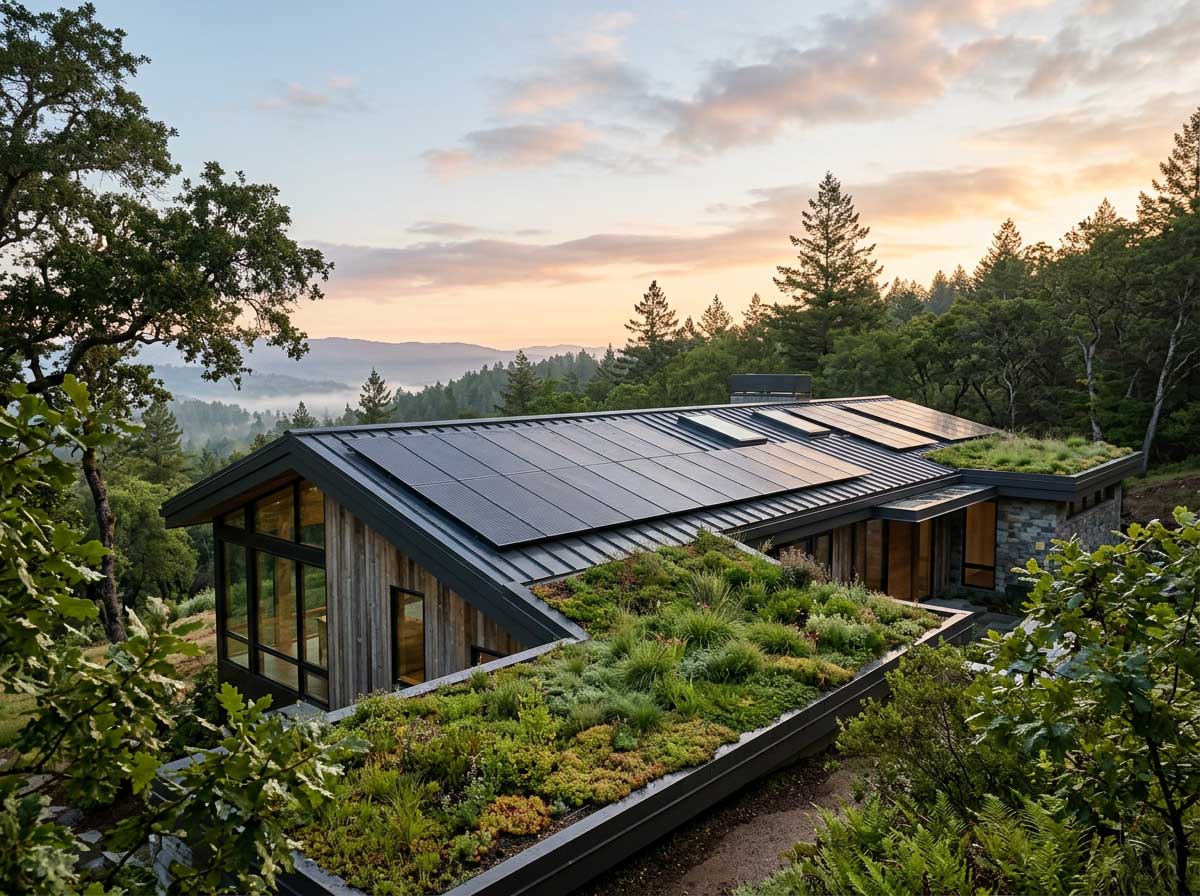
Start with the elements visitors encounter in their first 30 seconds. Compare the facade, entrance sign and reception area with your website and customer materials. A sustainability-focused brand might use visible recycling stations, natural light and responsibly sourced finishes. The article on visualizing a brand’s green initiatives offers further ideas for making environmental commitments clear without relying on vague claims.
Translating Online Branding to Physical Spaces
Create a short visual guide for the property before selecting finishes or commissioning signs. It should specify approved colors, typefaces, materials, lighting qualities and photographic styles. This keeps decisions consistent when several contractors or departments contribute to the project.
Focus next on functional features that occupy a large share of the visitor’s view. Entrances, shutters and roller doors can affect the overall composition because of their scale and placement. Their colors, lines and surrounding finishes should relate to the facade instead of appearing as isolated additions.
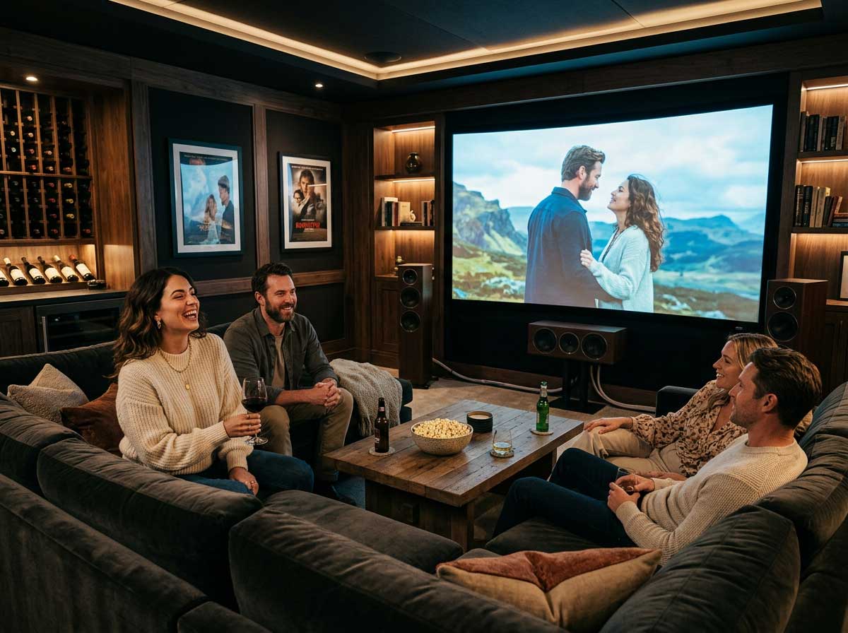
The same principle applies indoors. A calm online identity may translate into warm lighting, uncluttered service counters and clear signs. Practical discussions of branding through architecture also show how environmental design can connect a brand’s graphic identity with the way people experience a space.
Upgrade Exterior Facades and Access Points
Assess the exterior from the sidewalk, parking area and main approach route. Photographs taken in daylight and after dark can reveal faded paint, inconsistent lighting or signs that are hard to read. Fix maintenance problems first, since new graphics won’t compensate for damaged surfaces or poor visibility.
Then prioritize changes according to customer impact. Refreshing the entrance color, replacing outdated lettering and improving pathway lighting may produce a clearer result than a full facade renovation. Access points should also be easy to identify from a reasonable distance. If visitors regularly enter through the wrong door, the issue may be placement and visual hierarchy, not a lack of signage.
Review the exterior every six months. Seasonal wear, plant growth and temporary notices can gradually weaken an otherwise coordinated design.
Balance Security with Contemporary Design
Protective features should support a welcoming appearance and straightforward movement through the property. Start with sightlines. Reception staff need a clear view of the entrance, while visitors should be able to identify where to go without encountering confusing barriers. Good lighting, visible address numbers and controlled access can support this goal without making the building feel severe.
Choose finishes that repeat materials already present on the facade. Dark metal frames may suit a modern building, while powder-coated elements in an established brand color can look more integrated. Accessibility also deserves attention at every entrance. Check door clearances, thresholds, handles and approach routes during daylight and evening hours.
A final walkthrough should follow the visitor’s actual route from arrival to reception. That simple test often exposes mismatched signs, awkward access points and neglected surfaces that drawings alone can miss. When those details align, the building becomes a credible physical expression of the brand.