Why do we combine fonts on a website?
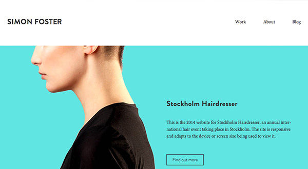
While using too many fonts in a design is most often disastrous for the overall design, using just one can make for a boring and uninspiring. Pairing fonts, using a serif and a sans serif can create visual cues (i.e. this is a head, this is the body, or to draw attention to a key point), can also relieve the monotony on a site or page. Typography for the web used to be limited to a few standard fonts that lived on most computers, or an image imitating type, for headings mainly, which Google couldn’t read (apart from (usually) heavily keyword stuffed “alt tags”.
These days however with the advent of CSS3 and “font-face” typography tools, designers have a much more satisfying time, when they design a website. It is so easy these days, that it could be said that we have too many options for font choices. We are able to set a typography hierarchy for Headings (h tags) and paragraphs (p tag) so Google can actually read the content. This allows for greater understanding of the site fro an SEO point of view, and also greater accessibility for visitors, enhancing the user experience (UX).
Having text as actual text, and not an image, makes it much easier to design, as there are fewer impediments for the web designer.
Below is a list of attractive typography pairings as well as very useful cheat sheet.


