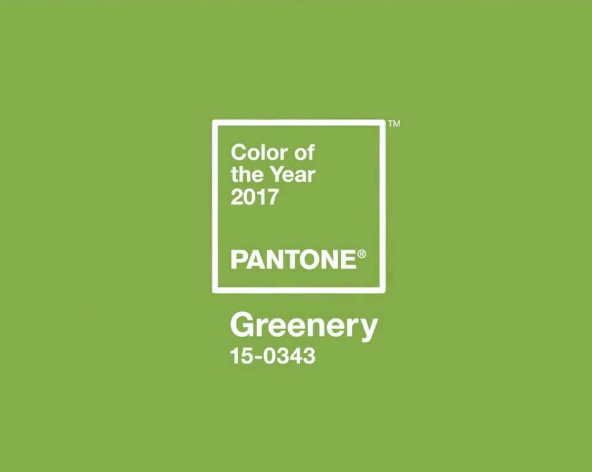
If you didn’t hear my nerdy squeal of delight, Greenery, the new Pantone Colour of the Year is out and think I like it. It will work across a wide range of media and is a fresh, pure colour. In a world that seems morally bankrupt and causing irreparable damage to our planet for the sake of economics, a colour that signifies new growth is a beautiful and optimistic choice.
GREENERY or PANTONE 15-0343 as on the Pantone website is “refreshing and revitalizing shade, Greenery is symbolic of new beginnings” and “nature’s neutral”.
This refreshing shade is popping up through the use of foliage in store and exhibition stand design. The shade reflects our desire to transcend our urban environment, breathe deeply and reboot.
“While Serenity and Rose Quartz, the PANTONE Color of the Year 2016, expressed the need for harmony in a chaotic world,” said Leatrice Eiseman, Executive Director of the Pantone Color Institute “Greenery bursts forth in 2017 to provide us with the hope we collectively yearn for amid a complex social and political landscape. Satisfying our growing desire to rejuvenate, revitalize and unite, Greenery symbolizes the reconnection we seek with nature, one another and a larger purpose.”
What is the PANTONE Color of the Year?
“A symbolic color selection; a color snapshot of what we see taking place in our global culture that serves as an expression of a mood and an attitude.”


Greenery in Fashion and At Home


Some Ideas
I’ve seen some shag pile rugs that look like grass, and I particularly like decor where there is wood contrasting with the Greenery shade. I believe the key to this colour is to keep it simple and contrast it with organic shades.
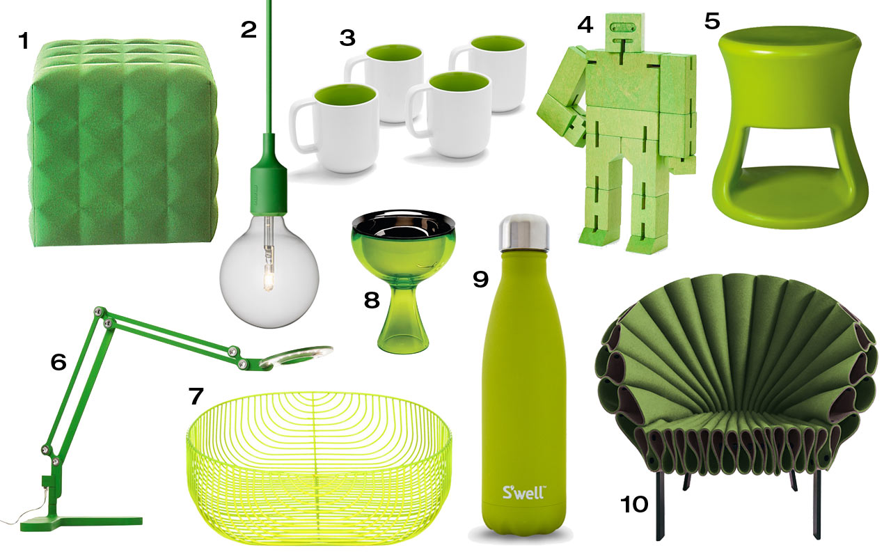
Image source: design-milk.com
Save
Save

